ClarityIQ : Turning Data Exhaust into Executive Clarity.
Enterprise leaders don’t suffer from a lack of data — they suffer from decision gridlock.
This tool was built to fix that: surfacing what matters, when it matters — enabling teams to act with foresight, not hindsight.

Signal Over Noise
Project Overview
ClarityIQ is an AI-powered data intelligence dashboard designed to turn overwhelming financial complexity into fast, confident decisions.
Built for analysts, risk teams, and C-suite decision-makers, ClarityIQ was designed to illuminate critical patterns across vast, siloed datasets and deliver insight when it matters most. The platform combined explainable AI, intuitive visualizations, and natural language querying to help institutions move from retrospective reporting to proactive strategy.
From fraud detection and market forecasting to compliance and investment intelligence, ClarityIQ helped finance teams not only see—but act—with clarity.
My Role: Lead Product Designer/Product Manager
As Lead Designer and Individual Contributor on this initiative, I guided ClarityIQ from concept through launch:
- Product Strategy & Roadmap — Defined long-term product vision and strategic roadmap in partnership with executive and engineering leadership
- Market & Competitive Research — Evaluated industry benchmarks (e.g., Palantir, Tableau with AI extensions) to identify whitespace and positioning opportunities
- Requirements Gathering & Prioritization — Synthesized input from internal data teams, regulatory experts, and financial stakeholders to shape backlog and release strategy
- Persona Development & Journey Mapping — Conducted user research with quants, analysts, and compliance leads to uncover needs, pain points, and ideal UX pathways
- UX/UI Design — Led all design efforts from IA and wireframes to pixel-perfect prototypes, ensuring visual clarity and data usability at every step
- Data Visualization Strategy — Developed visual standards for surfacing AI-generated insight alongside traditional financial data, balancing density and readability
- Natural Language Query (NLQ) Interface: — Designed a conversational layer that allowed users to query data in plain English and receive real-time visual responses
- Usability Testing — Ran three rounds of testing to identify sticking points and refine AI affordances
- AI Integration & Explainability — Collaborated with ML teams to ensure all AI-driven features were transparent, interpretable, and contextually justified within the UI
- Prototyping & Testing — Ran multiple usability cycles using realistic data scenarios; refined UI and workflows based on task performance and trust metrics
"It is so cumbersome to get timely, reliable answers from data we already have."
Framing the Challenge
Despite the explosion of data in finance, teams often remained overwhelmed, under-informed, and slow to act. ClarityIQ set out to solve a simple but stubborn problem: how to make complex financial data – and AI-powered insights – accessible, trustworthy, and actionable for every level of decision-maker
What’s the cost of disjointed insight?
- Misaligned decisions
- Delayed escalations
- And very expensive meetings that leave no one smarter
Key Challenges
Design an AI-native interface to cut through data chaos — surfacing what matters, when it matters, to the people who need it. It needs to balance:
- Data Overload & Fragmentation: Analysts faced sprawling, siloed data sources with limited interoperability
- Opaque AI Models: Stakeholders were wary of insights they couldn’t interrogate or explain to compliance teams
- Tool Sprawl: Existing workflows required juggling between BI dashboards, spreadsheets, and risk models
- NLQ Skepticism: Early NLQ tools were either too rigid or too imprecise to be trusted in high-stakes environments
- Slow Time-to-Insight: By the time data was cleaned, modeled, and visualized, the window for action had often passed
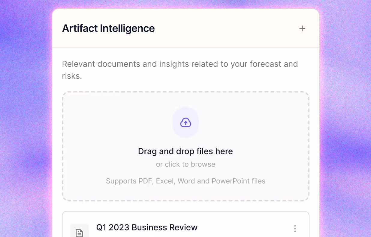
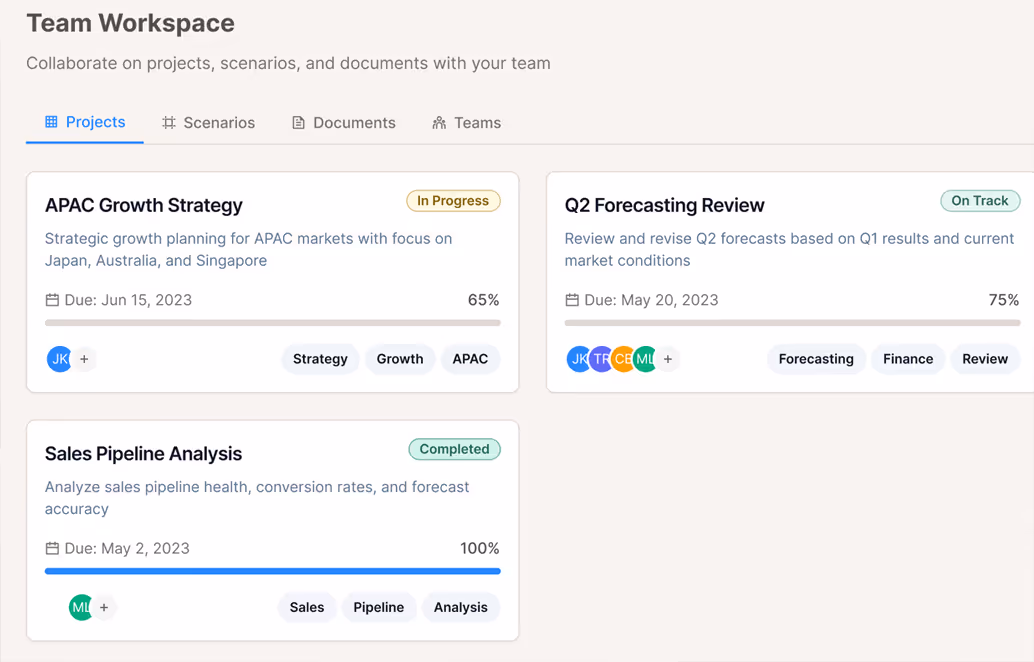
1
Drag'n Drop Reports and memos2
Instantly extract insight-rich excerpts3
Surface relevance to aid decisions
Needs + Wants
What They Asked For
“We don’t need more charts—we need clarity.”
– Enterprise Ops Lead, Fortune 100 ITSM Division
Across stakeholder interviews, one theme kept surfacing: insight wasn’t the problem – fragmentation was. Everyone had tools. What they lacked was synthesis.
Quotes that surfaced repeatedly:
- "We don't know what’s critical until it’s already escalated."
- "Every team has its own tools, but no one has the full picture."
- "There’s too much data, and not enough direction."
- Item 1
- Item 2
- Item 3
"We don't know what's critical until it's already escalated".
Key Needs Identified
- Unified Visibility
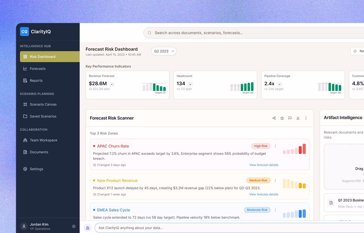
Break down data silos and surface system health, KPIs, and incident signals in a single pane of glass—eliminating context-switching and tool fatigue. - Proactive Intelligence
Use AI to highlight anomalies, risks, and trends before they breach SLAs or customer trust thresholds. - Decision Support for Humans
Present decision-relevant insight—not just metrics. (e.g., “SLA dips tied to API latency across key regions”.) - Cross-functional Awareness
Help Engineering, Product, Ops, and Compliance teams see shared impact—not just their own vertical slice.
Bottom line: They weren’t asking for prettier dashboards or visual polish. Rather, they needed something they could work alongside with.
- Item 1
- Item 2
- Item 3
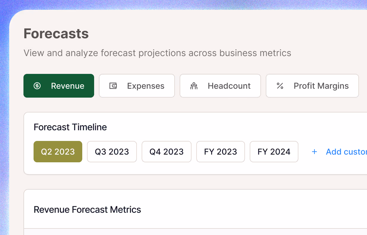
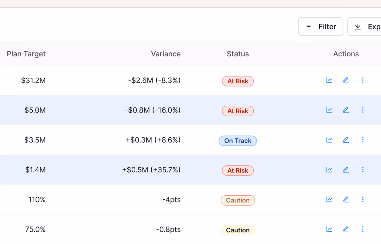
1
Navigate by quarter or fiscal year2
View revenue, expenses and margins3
Identify deltas and drivers at a glance
System Intelligence
Interface Logic
The goal here wasn't to impress or overstate AI. Simply put, it was to reduce mental and cognitive overload. To aid decision making.
Every visual, insight card, and interaction model was crafted to do one thing: help financial teams cut through the noise and act with certainty. Instead of layering more data on top of existing chaos, ClarityIQ was designed to reduce mental overhead, spotlight critical trends, and build trust in AI-driven intelligence.
Dashboards in financial services are often dense and paralyzing. We flipped that norm—clarity came first, polish second.
- Item 1
- Item 2
- Item 3
"What's slowing resolution times?"
Design Goals
- Use the voice of a trusted analyst – not a system log.
It should sound like someone who's done this before, not someone dumping data on your desk. - Don’t bury the signals in rows of green.
What’s off-track should stand out first — even if everything else is “fine.” - Handle questions the way a senior analyst would.
Enable natural queries like:- “Which region’s missing its SLA targets?”
- “What’s slowing resolution times this week?”
- Embed AI without the mystery.
AI-driven recommendations were paired with contextual justifications— confidence scores, feature attributions, historical benchmarks —ensuring interpretability, not just automation.
- Item 1
- Item 2
- Item 3

Always in Flow
System Feedback Without the Friction
If it gets in the way, it isn’t insight — it’s noise...It should appear at the moment of doubt, and questioning. And importantly, it should not get in the way.
In operations, attention is scarce. Interfaces need to respect that. Feedback should run in parallel to their task, not pull them out of it. Think of it as a quiet second layer — always present, never in the way.
Design Principles:
- Prioritize proximity.
Place alerts and context where the user already is — the right alert in the wrong place is still easy to miss. - Don't make users hunt for status.
Avoid “dead ends” where users have to manually cross-reference other views to understand impact or resolution status. - Use Color, Motion, and Microcopy to answer one question:
“Where should I look next?”
Key Feedback Patterns
- Status chips displaying service and system health at a glance (e.g., Degraded, At Risk)
- Micro trend lines below KPIs to show drift without switching to new views
- Soft warnings. when performance dips – not just after it breaks
- Inline confirmations to show when tasks close themselves
- Context-aware tooltips that shifted tone, depth, and urgency based on the user’s role and risk level
We weren’t designing charts for decoration. We were building a quiet layer of foresight — always-on, low-friction signals — so teams could move faster without second-guessing.
- Item 1
- Item 2
- Item 3
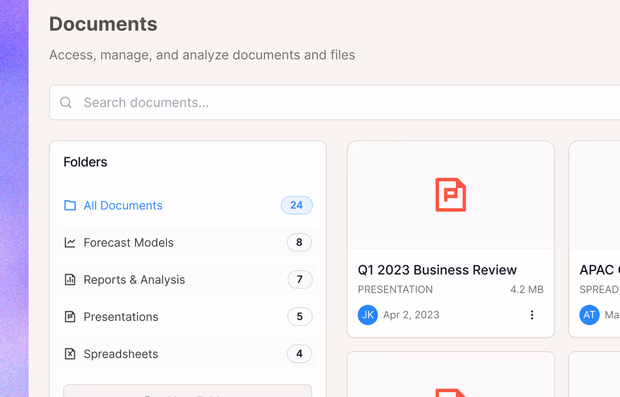
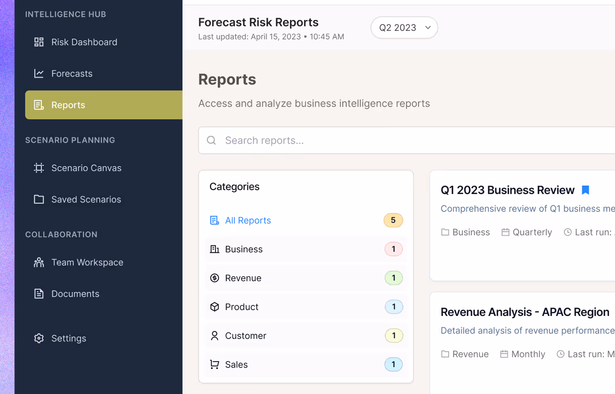
1
Centralize reports, models and slides2
Tag and filter by forecast relevance3
Enable knowledge reuse across cycles
Design for Confidence
Built for Decisions, Not Discovery
Metrics weren't the end goal.
They were just the trail markers for knowing what to do next.
The interface wasn’t meant for wandering — it was built to shorten the path to a next move. Each element existed to answer one question:What needs attention right now?
Signals that Helped People Trust the Screen:
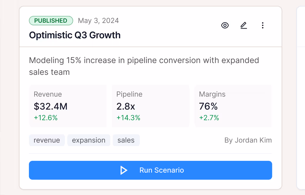
- Forecasts grounded in reality
AI trends were checked against history — and always shown with visual context.→ “Ops backlog will rise ~17% based on six-week regression.” - Every number came with a sentence
Every metric had an optional plain-English interpretation—summarizing what changed, why, and what to consider next.
→ “Uptime improved, but Tier 2 tickets surged. Reassigning leads may help balance load.” - Design stayed calm — even when the data didn’t
Layout, interaction, and color language were designed to avoid false urgency. No pulsing, no fear bait—Signals only when and where it mattered.
- Item 1
- Item 2
- Item 3
Learnings
Realizations + Reframes